
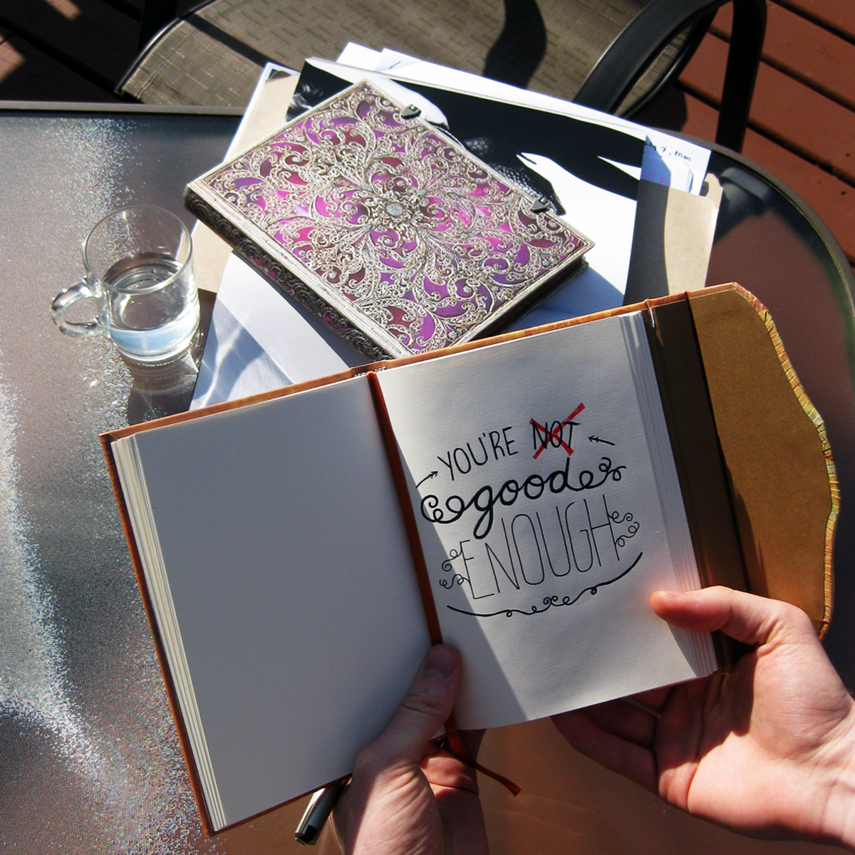
In a recent two-part Peek Inside article, we helped Laura upgrade her current journalling style to make her notebook pages more visually appealing. One great way to improve the overall look of your journal entries is to add a hand lettered element, especially a title or a keyword or phrase you want to stand out.
Of course, not all of us are naturally gifted script designers and the memories of grade school attempts at cursive writing still sit uncomfortably in our minds. Hand lettering is a modern spin on classic handwriting styles, combining calligraphy with typography, graphic design and even graffiti elements.
Caitlin Jordan at Canva Design School recently posted an excellent blog article showing forty hand lettering examples, each one showcasing a different approach to take, along with professional advice on how to incorporate it into your own writing. Before diving into these expert tips, we thought we would set you in the right direction with these four guidelines to learning hand lettering. Once you are comfortable with this artistic style, you will be ready to try any of those forty examples, or even create your own method!
1) You Can Take Your Pen Off the Page
A big thing that separates modern hand lettering from classic calligraphy is the continuity of the brush or pen strokes. In calligraphy, the letters are created by single, continuous strokes but in hand lettering you can (and should) fill in different elements in segments. This allows for increased differentiation in colour and line thickness, giving you even more options when creating your letters and overall design.
2) Study, But Don’t Stick To, Existing Fonts
And this is the way that hand lettering differs from typography – you can be inspired by existing fonts and type rules but do not have to stick with them. There is no set rule about mixing and matching styles and you are free, even encouraged, to create your own fonts. Of course, studying the classics and modern additions to the world of type will only help and inspire you when it comes to thinking of new approaches, so don’t avoid them entirely!
3) You Are Not On Your Own
Hand lettering is a hugely popular trend right now, from online micro videos to real-life restaurant chalkboards. Luckily for you, this means there are endless resources available for aspiring letterers. We especially appreciate the tutorials and practice sheets provided by Dawn Nicole Designs. The Letter Shoppe also has a great compendium of resources available for you to browse through and find the hand lettering lesson that’s right for you.
4) The Right Tools are Key
Have you ever tried to create really beautiful script using a cheap ballpoint pen? Probably not, because it’s not the right tool for the job. If you are serious about getting into the lettering game (there are great freelance opportunities out there) then it is important to invest in the right pens or markers. You can use any sort of pencil (or even that trusty ballpoint) to sketch the layout of your design (check out Creative Market’s step-by-step tutorial for more), but for filling it in you will want some nicer pens or markers. We recommend reading some of the above tutorials or checking out your favourite online letterer (like Lai, whom we recently interviewed!) to see what tools are being used to create the type of lettering style you like best. Then head on over to your local art store to pick up your own set!

In Conclusion
Hand lettering is less restricting that the art forms that it draws upon, meaning you really can’t go wrong! By seeking inspiration from artists you admire and following any expert advice you can find, you will be well on your way toward crafting your unique and eye-catching hand lettered designs!
About Paperblanks®: At Paperblanks, we believe that art should have a place in all aspects of life. That’s why we follow the artist’s way in everything we do – creating, crafting and releasing designs we believe have the power to touch people. For more about Paperblanks, go to our website at paperblanks.com.


What a great set of tips, although I would say that my experiences with calligraphy do involve some picking up of the pen off the page. I would advise anyone interested in lettering to take a look at Pinterest and also their local library.
There is a great joy in discovering ones favourite pens that a ball point could never cover! The Paperblanks series is very good for fountain pens and the ink doesn’t bleed through.
Also, many thanks to the advice about customising your own lettering styles. It is lovely to find the lettering of one style and mixing a few in with another style.
Hi Rachael,
We’re so glad that you have found these useful! And thanks for your clarification on calligraphy. I suppose we made a bit of a generalisation there.
Don’t forget to show off your calligraphy and lettering on Facebook, Twitter or Instagram! We are always looking for creative Paperblanks users to profile on the Endpaper Blog 🙂
Cheers!